
Virti's mobile experience has been redesigned with a cleaner layout, giving more space to your Virtual Humans and Interactive Videos so it's easier to focus on what matters.
The mobile navigation menu
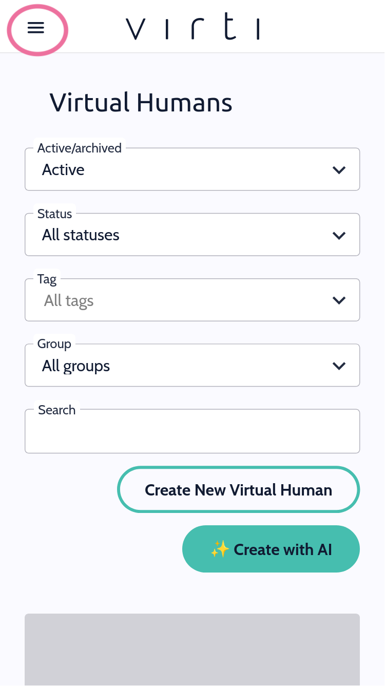
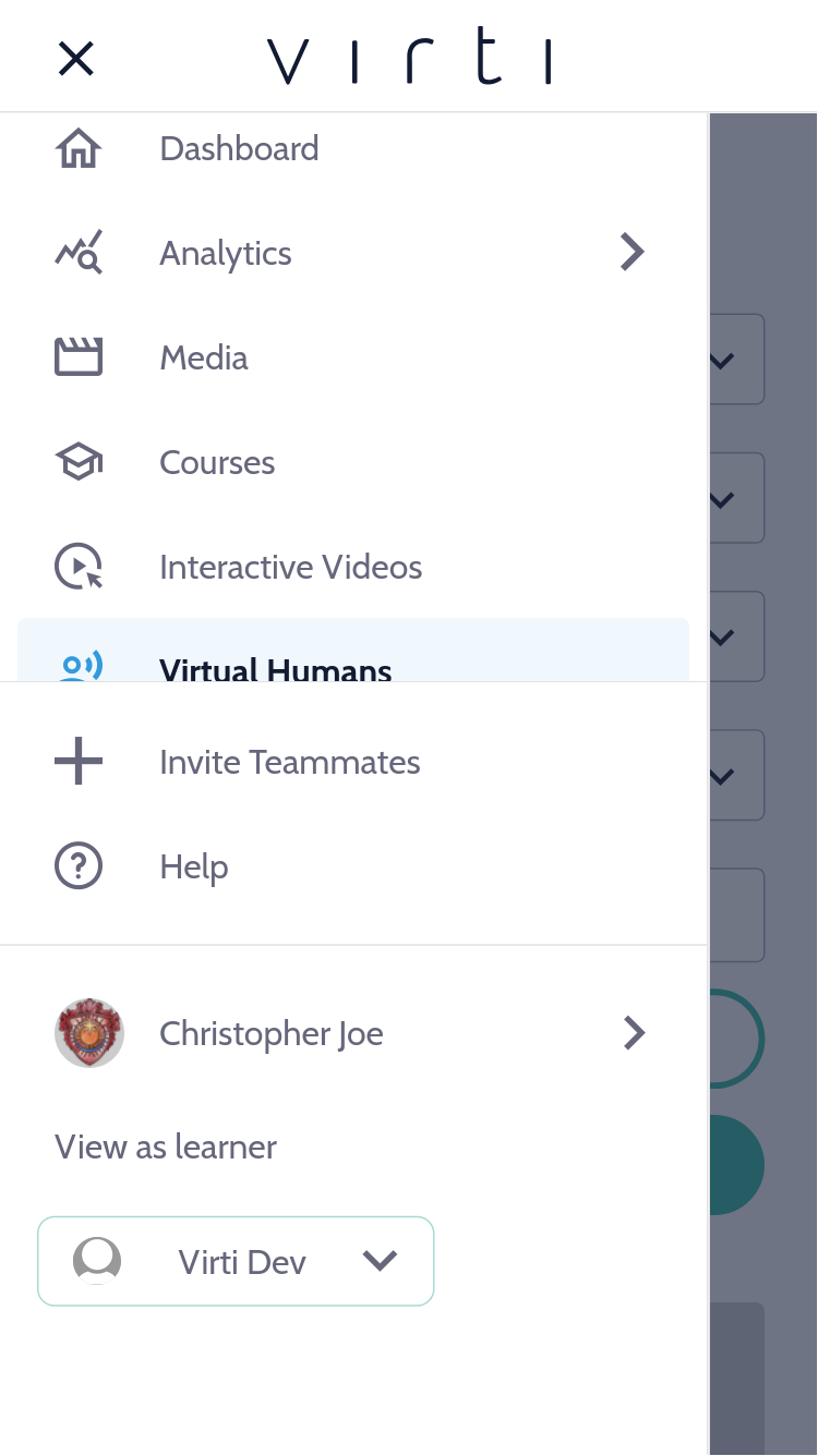
On smaller screens, Virti's main navigation moves into a hamburger menu so your content has more room on screen.
Tap the menu icon in the top corner to open navigation.
Select any section — Virtual Humans, Simulations, Courses, Analytics, and more — the same sections you'd find on desktop.
Tap outside the menu, or select a destination, to close it.
The mobile sidebar
Where a page has a secondary sidebar (for example, filters or settings), it collapses into a slide-out panel on mobile so it doesn't crowd the main content.
Look for the sidebar toggle to open the panel.
Make your selection — the panel closes automatically, or you can dismiss it manually.
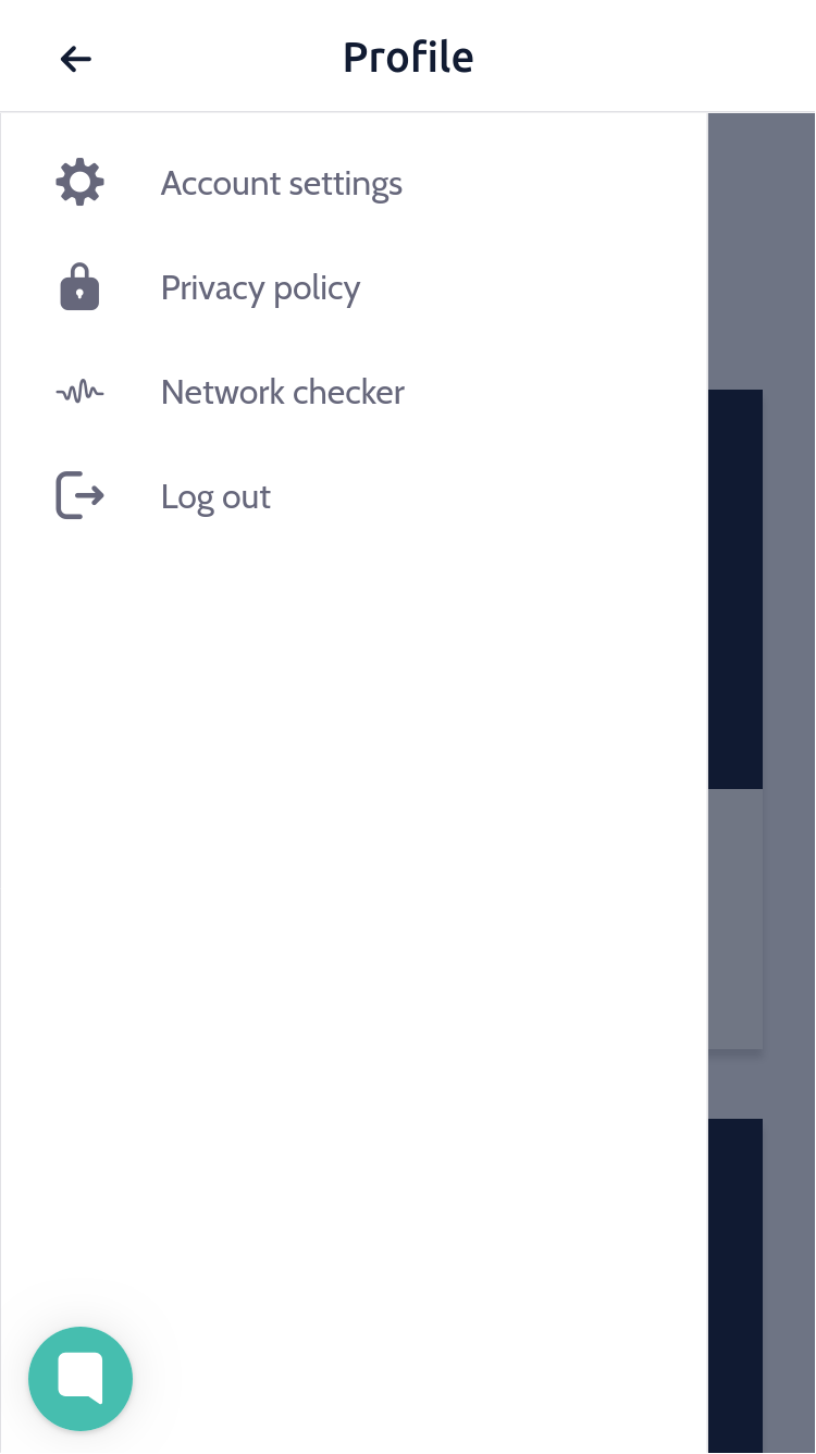
Best Practice: If you're demoing Virti on a phone or tablet, take a moment to get familiar with the collapsed menu and sidebar beforehand, content is in the same place as desktop, just tucked behind a tap.
💡 Tip
Need more help? Get support from our Virti Support Team via [email protected]